The whole image does not show on my iPhoneWhen combining photos it is always a good idea to leave an equal amount of space (margins) between them. This collage would look better (imo) with a 5px white spacing between all the photos (vertically and horizontally).I emailed you this Facebook cover if you want to use it. No text added about the B&B name as it is already put on there by FB (which is why I let that area void-ish as it will be covered up). Note - everyone on FB today I see we have @ just below our B&B names, finally!
.
. I agree in most instances, I personally prefer no borders for Facebook. But what I do think everyone should do is check their Facebook header on mobile devices (to make sure that if they have added text on the image that it is showing, and not hidden-off the page) if they want it to show.dumitru said:When combining photos it is always a good idea to leave an equal amount of space (margins) between them. This collage would look better (imo) with a 5px white spacing between all the photos (vertically and horizontally).
and yes the header does look fantastic, thanks for the kind words.
.
You are using an out of date browser. It may not display this or other websites correctly.
You should upgrade or use an alternative browser.
You should upgrade or use an alternative browser.
Pro Photos Received
- Thread starter gillumhouse
- Start date

Help Support Bed & Breakfast / Short Term Rental Host Forum:
This site may earn a commission from merchant affiliate
links, including eBay, Amazon, and others.
The whole image does not show on my iPhoneWhen combining photos it is always a good idea to leave an equal amount of space (margins) between them. This collage would look better (imo) with a 5px white spacing between all the photos (vertically and horizontally).I emailed you this Facebook cover if you want to use it. No text added about the B&B name as it is already put on there by FB (which is why I let that area void-ish as it will be covered up). Note - everyone on FB today I see we have @ just below our B&B names, finally!
.
. I agree in most instances, I personally prefer no borders for Facebook. But what I do think everyone should do is check their Facebook header on mobile devices (to make sure that if they have added text on the image that it is showing, and not hidden-off the page) if they want it to show.dumitru said:When combining photos it is always a good idea to leave an equal amount of space (margins) between them. This collage would look better (imo) with a 5px white spacing between all the photos (vertically and horizontally).
and yes the header does look fantastic, thanks for the kind words.
.
.
That is what happens to all of them. And it looks terrible on the iphone/ipadEmptyNest said:The whole image does not show on my iPhone
Hmmm guess I have not really paid attention before. :-(The whole image does not show on my iPhoneWhen combining photos it is always a good idea to leave an equal amount of space (margins) between them. This collage would look better (imo) with a 5px white spacing between all the photos (vertically and horizontally).I emailed you this Facebook cover if you want to use it. No text added about the B&B name as it is already put on there by FB (which is why I let that area void-ish as it will be covered up). Note - everyone on FB today I see we have @ just below our B&B names, finally!
.
. I agree in most instances, I personally prefer no borders for Facebook. But what I do think everyone should do is check their Facebook header on mobile devices (to make sure that if they have added text on the image that it is showing, and not hidden-off the page) if they want it to show.dumitru said:When combining photos it is always a good idea to leave an equal amount of space (margins) between them. This collage would look better (imo) with a 5px white spacing between all the photos (vertically and horizontally).
and yes the header does look fantastic, thanks for the kind words.
.
.That is what happens to all of them. And it looks terrible on the iphone/ipadEmptyNest said:The whole image does not show on my iPhone
.
Hmmm guess I have not really paid attention before. :-(The whole image does not show on my iPhoneWhen combining photos it is always a good idea to leave an equal amount of space (margins) between them. This collage would look better (imo) with a 5px white spacing between all the photos (vertically and horizontally).I emailed you this Facebook cover if you want to use it. No text added about the B&B name as it is already put on there by FB (which is why I let that area void-ish as it will be covered up). Note - everyone on FB today I see we have @ just below our B&B names, finally!
.
. I agree in most instances, I personally prefer no borders for Facebook. But what I do think everyone should do is check their Facebook header on mobile devices (to make sure that if they have added text on the image that it is showing, and not hidden-off the page) if they want it to show.dumitru said:When combining photos it is always a good idea to leave an equal amount of space (margins) between them. This collage would look better (imo) with a 5px white spacing between all the photos (vertically and horizontally).
and yes the header does look fantastic, thanks for the kind words.
.
.That is what happens to all of them. And it looks terrible on the iphone/ipadEmptyNest said:The whole image does not show on my iPhone
.

$22.99 ($0.66 / Fl Oz)
ECO amenities Hotel Mini Shampoo Sachets for Guests - Refreshing Green Tea Scented Toiletries for AirBnB & Rentals - 0.35 fl oz (10ml), 100 Pack
Infinite-Commerce

$5.22
$14.95
So -- You Want to be an Innkeeper: The Definitive Guide to Operating a Successful Bed and Breakfast Inn Third Edition, Revised and Expanded
JS Carolina Commerce

$49.99 ($0.33 / Fl Oz)
$52.99 ($0.35 / Fl Oz)
Travel Size Toiletries Kits, Bulk Mini Hotel Guest Amenities (Tropical Coconut, 1oz each), 3-Piece Sets Refreshing Coconut Scent: 50 Shampoo & Conditioner 2 in 1, 50 Body Wash and 50 Body Lotion
NewDission
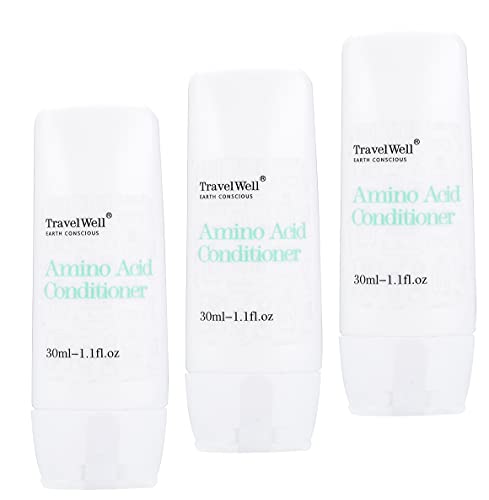
$23.99 ($0.44 / Fl Oz)
Travel Well Hotel Toiletries Amenities Travel Size Guest Conditioner 1.0 Fl Oz/30ml, Individually Wrapped 50 Bottles per Box
Daily Care Store
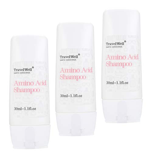
$25.99 ($0.52 / Fl Oz)
Travel Well Hotel Toiletries Amenities Travel Size Guest Shampoo 1.0 Fl Oz/30ml, Individually Wrapped 50 Bottles per Box
Daily Care Store

$11.99 ($0.12 / Ounce)
$21.99 ($0.22 / Ounce)
Eco Amenities Travel Size Hair Conditioner for Women & Men - Hotel Supplies for Guests - Refreshing Bulk Travel Size AirBnB Toiletries - 0.35fl oz (10ml), 100 pack, Green Tea Scent - Easy Tear Sachets
Infinite-Commerce

$35.69 ($0.48 / Fl Oz)
NISGUR Travel Size Body Wash Bath Gel Bulk 0.75 oz Pack of 100 No Plastic Hotel Size Kraft Paper Pouch Packed Aloe and Green Tea Extract Infused Hotel Supplies and Toiletries for Guest
PERKS ROOM SUPPLY, INC

$30.99 ($8.85 / Fl Oz)
$53.50 ($15.29 / Fl Oz)
ECO amenities Travel Size Dishwashing Liquid - 60 Pack, 3.5 oz Bottles, Bulk Case of Dish Soap, Individually Packaged Kitchen & Cleaning Supplies, For Guests of Airbnbs, BNBs, VRBO, Inns and Hotels
BestHousewareSupport
- Joined
- May 22, 2008
- Messages
- 16,113
- Reaction score
- 764
Thank you. Took it with my phone this morning. Will pass it to my webmaster.
Kathleen
This photo you posted on facebook is soooo appealing. It needs to go on your website.
Wasn't sure if you'd see my comment on your facebook page so I've shared it here..
Share:


![Bed & Breakfast Tracker Plus [Download]](https://m.media-amazon.com/images/I/51m1WPxMV7L._SL500_.jpg)


![Bed & Breakfast Tracker Plus for Mac [Download]](https://m.media-amazon.com/images/I/51iSnnH5vmL._SL500_.jpg)


